Unmasking the We Can Be Heroes Logo
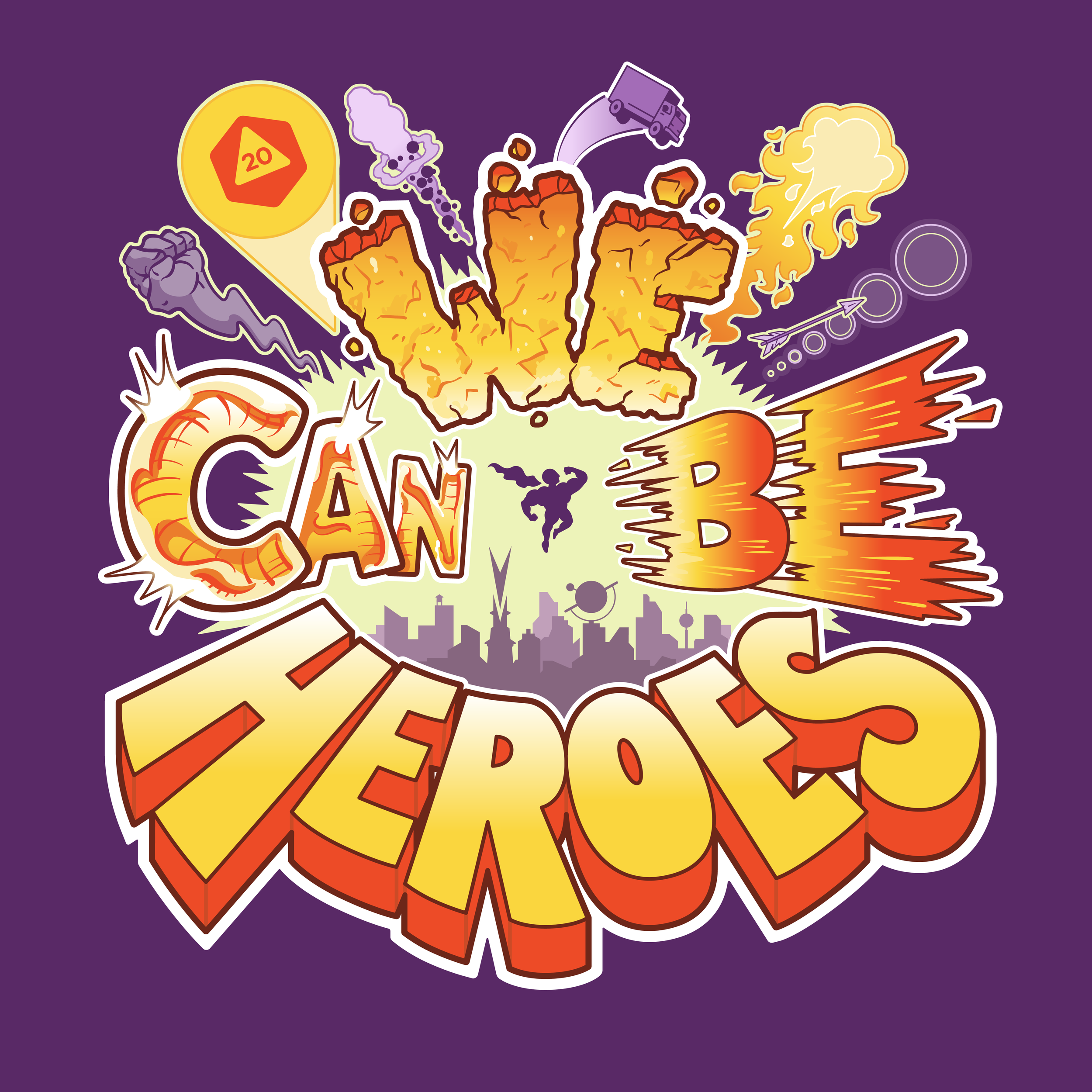
Today is an incredibly exciting day for us! We’re officially launching our We Can Be Heroes logo/branding. The logo was created by designer and illustrator Max Bare, who is also illustrating the player’s handbook.
The We Can Be Heroes logo is meant to represent the many opportunities you’ll have as a hero. It represents the different powers and abilities you’ll possess, crises you’ll avert, the cities you’ll rise up to protect, and at the center of it all is you the player, represented by a silhouette we’ve affectionately been calling Cape Man.
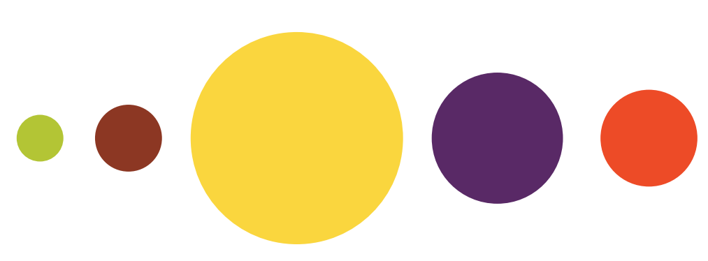
One of the big things we talked about when crafting our logo and choosing a color scheme was the inherent nostalgia that comes with superheroes. It’s impossible to think about superheroes without being transported back to your childhood, or to immediately recall a favorite movie, tv show, or comic book. Nostalgia is so intertwined with superheroes that we felt it was important to reflect it in our branding.
The color scheme is a callback to comic books of the 1970’s. Max’s big inspiration while putting the color palette together was one the coolest comic book women of the 1970s, Batgirl. My mind went to the greatest private investigator of all time and hero in his own right, Scooby-Doo.
We’re super excited to continue working with Max to illustrate We Can Be Heroes. Max has a knack for illustrating heroes and has several comic books published by Lion Forge (Rolled & Told), Scout (By the Horns) and Really Easy Press (Scally-Ho!). Max's series “HERO BEARDS” (sole creator) and “Scally-Ho!” (co-created w/ writer Alex Willan) are both accessible to Middle Grade readers, an audience which he is currently pivoting towards.
Max also creates comic work as brand activation for marketing, advertising and presentation/pitch purposes. Teaming up with his lovely partner, Melissa Sue Stanley, and their friend, Dave Schneider, Max helped establish Revolution Brewing’s comic identity in 2016 with its first comic book. Followed by a comic series, beer labels and other marketing material, Max’s contribution to the brand continues to grow.
Be sure to check out Max Bare’s work here.
We’re super stoked to have a logo that reflects the excitement and creativity this game brings! We hope you enjoy it as much as we do. Join our discord or tag us on social to tell us what you think!
Cheers!


